How to overlay charts in Microsoft Excel
It is too easy to overlay charts in Microsoft Excel , although Microsoft’s office application has a good selection of chart types, we may need something out of the ordinary. A graphic that that overlays may be what you need and a little further down we will show you how to apply it to your spreadsheet .
Create a combo chart in Excel
If we want to overlay charts in Microsoft Excel, a custom combo box is what you are looking for. You can combine cells and columns, bars, lines, areas, and various types of charts in a single image.
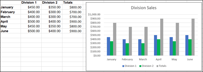
In the accompanying image, we have a column chart that allows us to see the sales of our two divisions along with the totals. As can be seen in the image, “Totals” appears out of place and does not allow the data to be displayed clearly.
If we use a custom combo chart, we can modify “totals” to a line in our column chart.
Change chart
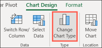
If we already have a graphic which we want to change, we will have to select it and go to the “Graphic Design” tab. Then we will click on “Change Chart Type” on the right side of the ribbon.
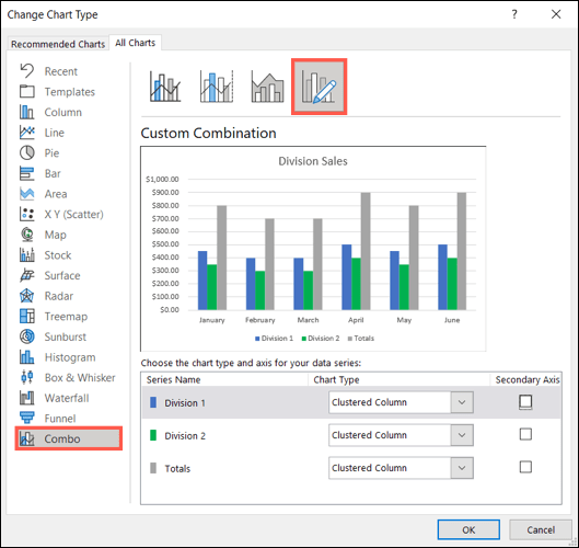
Once we are in the “Change chart type” window, we are going to choose “Combo” found in the left sidebar and “Custom combination” on the right.
Create a chart
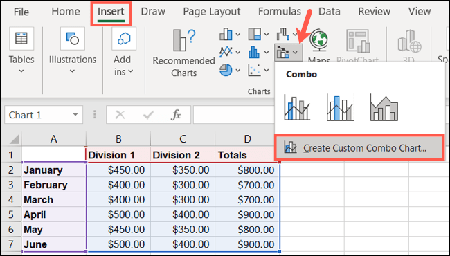
If we still do not have a chart, we will select our data and go to the “Insert” tab. In the “Charts” section of the ribbon, we will have to click on the drop-down arrow to Insert combo chart and select “Create custom combo chart”.
Set up a combo chart
If we have the Graph window open and the Custom Combination Table selected, then we can visualize the area with which we can work at the bottom.
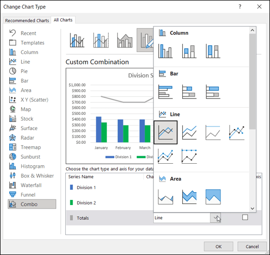
Next to each data series, we can choose the type of graph that we can use in the drop-down box. We can also add a secondary axis for any of the series by checking the box on the right.
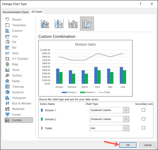
While we are making modifications, we can see a preview at the top to be able to change something if we want. Once we are satisfied, we will simply click “Accept”.
Read Also: How to make a flowchart in Excel
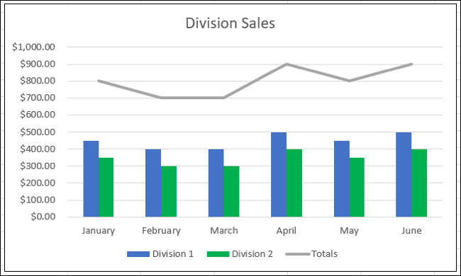
In this way we have a combo chart that shows the divisions as columns and total data as a line. Obviously, this allows us to appreciate the data we are trying to convey in a clearer way.